Case study 01 · UX/UI redesign · Content discovery · 2024
Southern Cross Travel Insurance: blog navigation
A navigation redesign for a travel-insurance blog full of useful articles that visitors could not easily find: a search bar with suggestions and filters, plus five clear categories.
- Role
- UX research, UX/UI design
- Challenge
- Make a large library of articles quick to search and browse for both experienced and first-time travellers, in line with the team's marketing and SEO goals.
- Duration
- February to April 2024
- Tools
- Figma, research and documentation tools
- Audience
- Readers aged 18 to 60

01 · What was the problem?
ConductedOverview
The Southern Cross Travel Insurance blog held a wealth of valuable content, but visitors found it hard to move through the articles. There was no intuitive way to search for a topic, which caused frustration and a weaker experience. The goal was to redesign the navigation so it was more user-friendly and drove more engagement.
The project ran from February to April 2024 and followed a design-thinking process: empathise, define, ideate, design and test. It is separate from the purchase-flow redesign for the same brand.
02 · What was changed?
ConductedProblem and solution
Target audience: people aged 18 to 60.
The problem
Visitors could not find relevant articles because there was no search function and the content was poorly organised. That led to frustration, a high bounce rate and reduced engagement.
The solution
A search bar at the top of the blog with auto-suggestions and filters, and articles organised into five categories: Travel Tips, Insurance Advice, Destination Guides, Customer Stories and Company News.
- Travel tips
- Insurance advice
- Destination guides
- Customer stories
- Company news
03 · What did the team see?
ConductedQualitative research
I interviewed the marketing team in person to understand the blog's experience. The conversations focused on content discoverability, how navigation affects engagement, and how improvements could make content more accessible and reduce bounce rates.
Findings: visitors struggled to find content without a structured navigation system. Many abandoned the blog or relied on external search engines to locate articles, and bounce rates were higher than the team expected, a sign of frustration in discovery.
From this I proposed a keyword search plus categorisation into key themes, to improve engagement and align with the marketing and SEO goals by making content more accessible and SEO-friendly.
Q1
What challenges do users face when navigating the Southern Cross Travel Insurance blog?
Q2
How do users typically find articles, and what difficulties do they encounter?
Q3
What are the most common topics users search for or request?
Q4
How does the blog currently contribute to marketing and SEO goals?
Q5
What metrics indicate whether users are engaging with the content effectively?
Q6
What improvements would enhance the blog's usability and discoverability?
04 · Who reads the blog?
ConductedPersonas
Two contrasting readers set the range the navigation had to serve: David, an experienced traveller who wants depth and filters, and Sarah, a first-time traveller who wants short, practical answers fast.
David Lee
38 · IT consultant · Experienced traveller
David is an IT consultant who travels frequently for work and leisure. He wants detailed, technical information on insurance options and travel destinations.
“I know what I'm looking for, but finding it on the blog shouldn't take this long.”
Technology comfort
- IT & Internet
- Software
- Mobile apps
- Social networks
Goals
- Stay updated on new destinations and insurance options
- Read customer stories and destination guides for inspiration
- Quickly compare insurance options and find detailed, technical information
Motivations
- A fast, efficient experience with quick access to in-depth content
- Expert insights and advanced travel advice
Challenges
- Dislikes cluttered, disorganised websites
- Finds it time-consuming to locate articles that match his advanced knowledge
- Frustrated by a lack of filtering options
Content preferences
- Detailed, in-depth guides with expert-level insights
- Reads mostly on desktop at home in the evening, sometimes on mobile while travelling
- Bookmarks and saves articles on platforms like Pocket
Sarah May
29 · Marketing coordinator · First-time traveller
Sarah is planning her first international trip. She seeks clear, practical advice on travel insurance and tips for first-time travellers.
“I just want a quick way to find the info I need without scrolling through endless articles.”
Technology comfort
- IT & Internet
- Software
- Mobile apps
- Social networks
Goals
- Find travel tips and insurance advice for her first international trip
- Research destinations and budget options
- Make sure she is fully covered for any potential issues
Motivations
- Informed decisions about travel insurance, with no surprises on the trip
- Practical, easy-to-understand travel planning advice
Challenges
- Overwhelmed by the volume of blog content
- Struggles to find articles on insurance and first-time travel tips
- Often leaves the site without finding what she needs
Content preferences
- Reads articles on mobile during her commute
- Prefers short, practical content such as travel tips and insurance advice
- Occasionally watches videos for travel inspiration
05 · Where is the gap?
ConductedCompetitor analysis
I compared the blog with Allianz, WorldCare and Cover-More. Search was the clearest gap: competitors offered some form of it, while Southern Cross offered none, despite strong categorisation, SEO and update frequency. This reflects the market as assessed in 2024, not a current review.
| Allianz | WorldCare | Cover-More | Southern Cross Travel Insurance | |
|---|---|---|---|---|
| Content focus | Travel insurance details and assistance services | Travel tips, destination guides and cultural insights | Travel insurance information and tips | Travel insurance, tips and destination guides |
| Content structure | Structured posts on insurance plans and travel advice | Organised by travel themes and destinations | Blog posts categorised by destination and travel tips | Categorised into clear sections (e.g. Travel Tips, Insurance Advice) |
| Search functionality | Advanced search with filters | Basic search feature available | Searchable content by category | No search bar |
| User engagement | Blog comments, social media engagement | Blog comments, social media integration | Blog comments, social media sharing | Blog comments, social media sharing |
| Visual design | Professional design with informative graphics | Clean design, easy navigation | Engaging visuals, interactive content | Simple, clean design with easy navigation |
| Mobile optimisation | Mobile-responsive with easy navigation | Mobile-optimised design | Fully responsive for mobile | Mobile-friendly layout |
| SEO performance | SEO optimised with comprehensive content | Moderate SEO, basic keywords | Strong SEO, focused on travel | Strong SEO with categorisation and clear headings |
| Content updates | Regular updates (monthly) | Regular updates (monthly) | Frequent updates (bi-weekly) | Regular updates (weekly/monthly) |
| Target audience | Travellers seeking detailed insurance information and assistance | Travellers interested in cultural insights and tips | Travellers looking for insurance advice and destination tips | Travellers seeking insurance information |
Allianz
Strengths
- Professional, clean design with informative graphics
- Detailed travel insurance content that builds trust
Weaknesses
- Less frequent blog updates make it harder to stay fresh
- Limited social media integration reduces interaction and sharing
WorldCare
Strengths
- Culturally relevant travel tips for a broad range of travellers
- Regularly updated, destination-based content
Weaknesses
- Limited search functionality compared to competitors
- Content organisation could be more intuitive; themes are scattered
Cover-More
Strengths
- Clear focus on travel insurance, with detailed coverage posts
- Strong SEO strategy helps the blog rank for relevant terms
Weaknesses
- Design and content could be more visually engaging
- Less non-insurance travel content limits broader appeal
Southern Cross Travel Insurance
Strengths
- Clear categorisation makes navigation easier
- Regular updates keep content fresh and relevant
Weaknesses
- No search function, so specific articles are hard to find
- Basic design with limited interactivity may affect engagement
06 · How do the pages work?
ConductedMid-fidelity wireframes
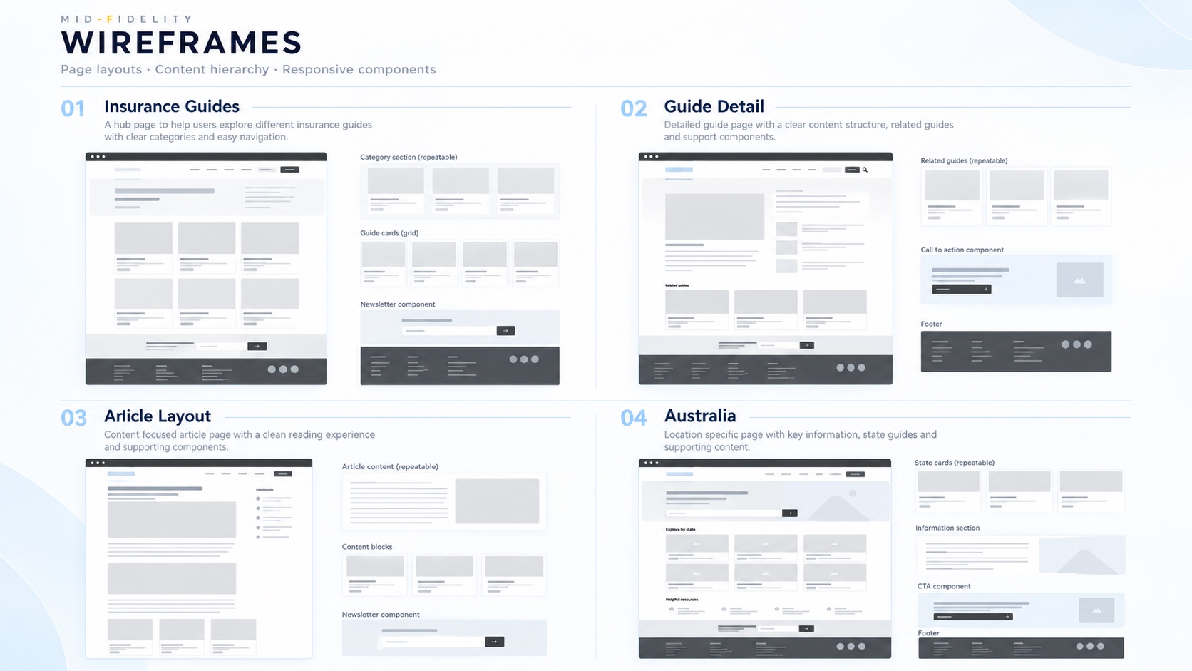
Mid-fidelity wireframes set out the page layouts, the content hierarchy and the responsive components before any visual design.
Insurance guides
A hub page that helps readers explore the different guides, with clear categories and easy navigation.
Guide detail
A detailed guide with a clear content structure, related guides and supporting components.
Article layout
A content-focused article page with a clean reading experience and supporting components.
Australia
A location-specific page with key information, state guides and supporting content.
07 · What did it become?
ConductedFinal design
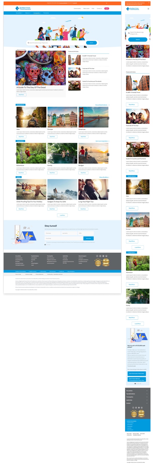
The finished blog on desktop and mobile: a search bar at the top, featured articles, and browsable destination, inspiration and safety sections, followed by a newsletter sign-up.
08 · How is it kept consistent?
ConductedStyle guide
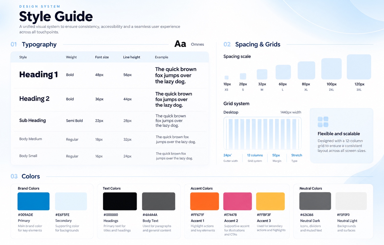
A compact design system documents type, spacing, grid and colour, so the redesigned navigation stays consistent with the brand and accessible across every touchpoint.
Outcomes
What came out of it.
- Reported
The changes were reported to increase search usage, reduce bounce rate and improve SEO performance, improving engagement and discoverability.
- Demonstrates
A research-led redesign: stakeholder interviews, two contrasting personas, a competitor review and a documented style guide.
Next case study
Datacom: The Big Shift
Read nextWorking on something similar?
Get in touch