Case study 04 · Web design · Local SEO · Healthcare · 2026
Acupoints: a clinic website built to turn searches into bookings
Design, build and local SEO for a West Auckland acupuncture clinic with a strong reputation and almost no digital presence.
Client work · Acupoints Medical & Wellness, Massey, West Auckland.
- Role
- Designer, developer and SEO, one person across all three
- Challenge
- Prove the clinic can help with a specific problem, prove it can be trusted with a body, and make the first appointment feel small.
- Client
- Acupoints Medical & Wellness
- Stack
- Next.js, React, Tailwind CSS
- Engagement
- Direct, with the clinic owner

01 · What was the brief?
ConductedOverview
A specialist acupuncture and Traditional Chinese Medicine clinic in Massey had the clinical reputation but almost no digital presence. I designed the site, built it, and did the search work to make it findable locally.
Doing all three meant the search terms and the page structure were decided together rather than in sequence.
02 · What does a first-time patient need, in order?
ConductedThe visitor's journey
A first-time visitor arrives from search, in pain and unsure whether acupuncture is for them. The journey has to answer that before it asks for a booking.
01
Local search
“Acupuncture near me”
02
Land on home
Is this for my problem?
03
Scan treatments
Pain, women's health, ageing
04
Check credibility
Experience, ACC registration
05
Check practicalities
Hours, parking, location
06
Book consultation
Free first appointment
03 · How was the site structured?
ConductedStrategy
A clinic website is a conversion path, not a brochure. It has three jobs in order: prove the practice can help with this specific problem, prove it can be trusted, and make the first appointment feel small. The structure follows that order rather than the one the business thinks in.
People search by symptom
The entry point is back pain or fertility, not acupuncture, so services are written around the patient's problem.
Trust is the decision
Years of clinical experience and ACC-registered provider status sit above the fold.
Lower the cost of yes
A free first consultation is the single primary action, repeated in the header, hero and close.
Remove practical doubt
Open seven days, evening appointments, private rooms and free parking get their own band, not a line in Contact.
04 · How do the pages work?
ConductedWireframes
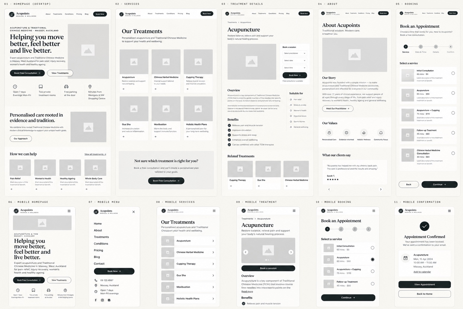
Wireframes set out the structure on desktop and mobile before any visual design: the home page, treatments, treatment details, about page and a step-by-step booking flow, plus the mobile menu and booking confirmation.
Home
Problem-led headline, a free-consultation action and the practical details (hours, rooms, parking, location) up front.
Treatments
A page per treatment with benefits, who it suits and related treatments, as the search strategy requires.
Booking
A short guided flow: choose a service, pick a time, add details and confirm.
05 · How does it feel and stay consistent?
ConductedDesign system
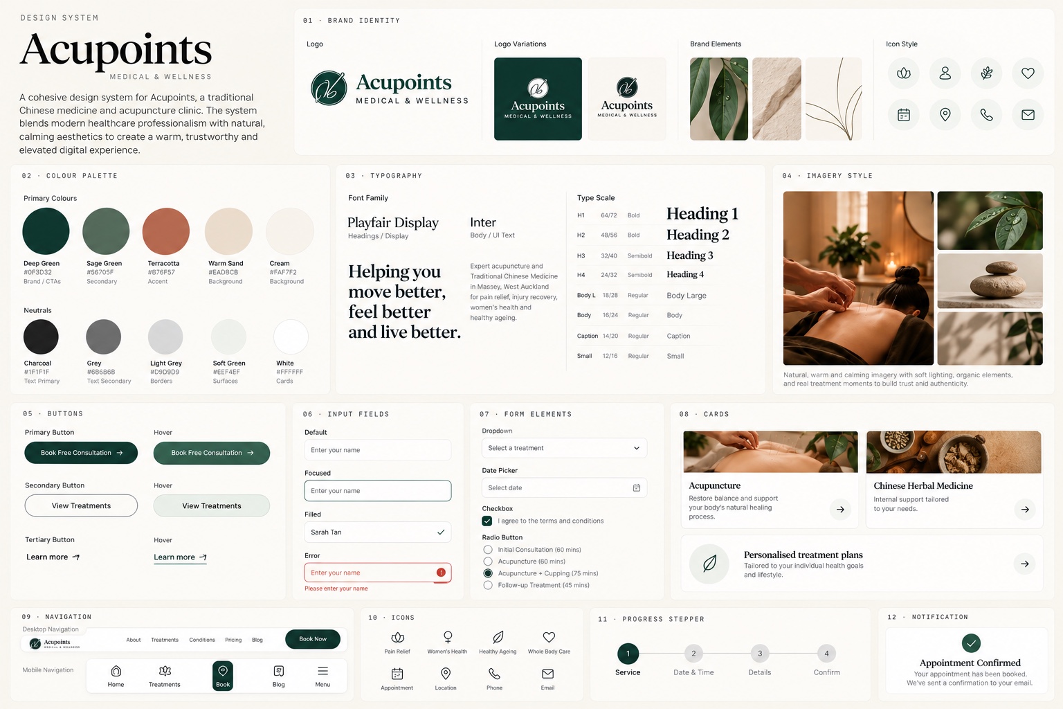
A cohesive design system blends modern healthcare professionalism with natural, calming aesthetics, to create a warm, trustworthy and elevated digital experience for a traditional Chinese medicine clinic.
Warm and natural
Deep green, sage and terracotta on cream, with natural, softly lit imagery and organic elements.
Credible and readable
A serif for headlines and a clean sans-serif for body and interface text, on a clear type scale.
Ready to build
Buttons, inputs, cards, navigation, a progress stepper and notifications, each with its states.
06 · What did it become?
ConductedFinal design
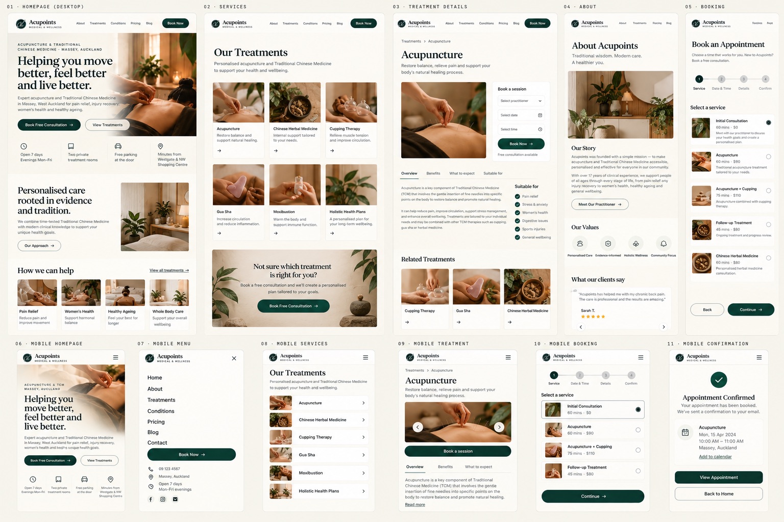
The finished site on desktop and mobile, built on the wireframes and design system: a problem-led home page with the practical details up front, a page per treatment, an about page, and a guided booking flow that ends in a clear confirmation.
07 · How does it get found, and stay fast?
ConductedBuild and local SEO
One page per treatment area rather than a catch-all services page, so each page matches the terms people actually search. Suburb, service area and practice details are carried in the content and structure, not bolted on.
Semantic headings and descriptive copy keep the pages legible to search engines and screen readers alike. On a photography-led site image weight is the main cost, so imagery is sized to its display slot: page speed is a ranking factor and a bounce factor at once.
08 · What did it teach me?
ConductedReflection
The instinct on a healthcare site is to explain the modality. What the visitor needs is to see their own problem named, then to be told that starting is safe and easy.
For a local business, search visibility and conversion are one design problem, not two projects. Trust signals are content, not decoration, and the cheapest conversion win is removing practical doubt: hours, parking, location.
Outcomes
What came out of it.
- Delivered
A search-led site with a page per treatment area, credibility above the fold and one repeated booking action, designed, built and optimised for local search by one person.
Next case study
Southern Cross Travel Insurance: a shorter, clearer path to buying cover
Read nextWorking on something similar?
Get in touch